Pro Skrub
Dry scrub based on natural zeolite Pro Skrub: website Work description: Logotype, packaging and website design Classic! Logo for dry scrub based on natural zeolite @pro_skrub. The monogram was difficult because of the similarity of the graphemes and all three round letters. When changing the position of the letters, the readability disappeared, but I just didn’t want to put letters in a row… In the gallery you can see how the logo is transformed with a horizontal layout. By the way, I want to remind you that the font is drawn by hand. This distinguishes the font recognizable logo from a simple typesetting name
Read More ›
Life trip
Travel agency Work description: Logotype design Do you like traveling? The best guide for hot countries I’ve ever seen: Life trip. The task of logo design was to create a symbolic image. There were many options: a compass, a constellation, a map, a paper airplane, a location marker on a map/balloon, etc. But the initials of the author, OL, which symbolize the globe and the mountains, proved to be the best option. The decision was unanimous! Okay, such a monogram is hard to confuse with other logos! The badge is self-limiting and will look good on hats and shirts
Read More ›
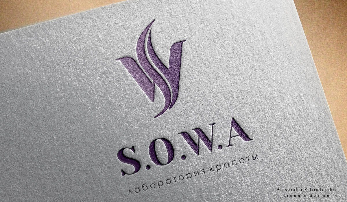
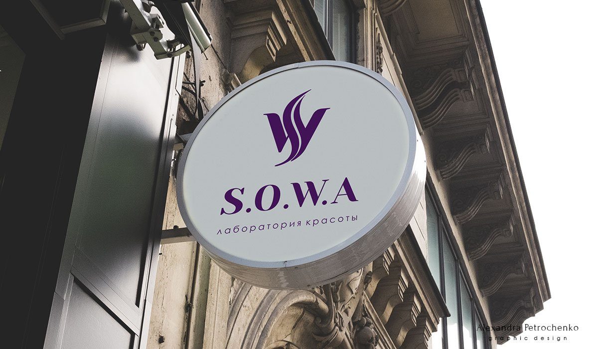
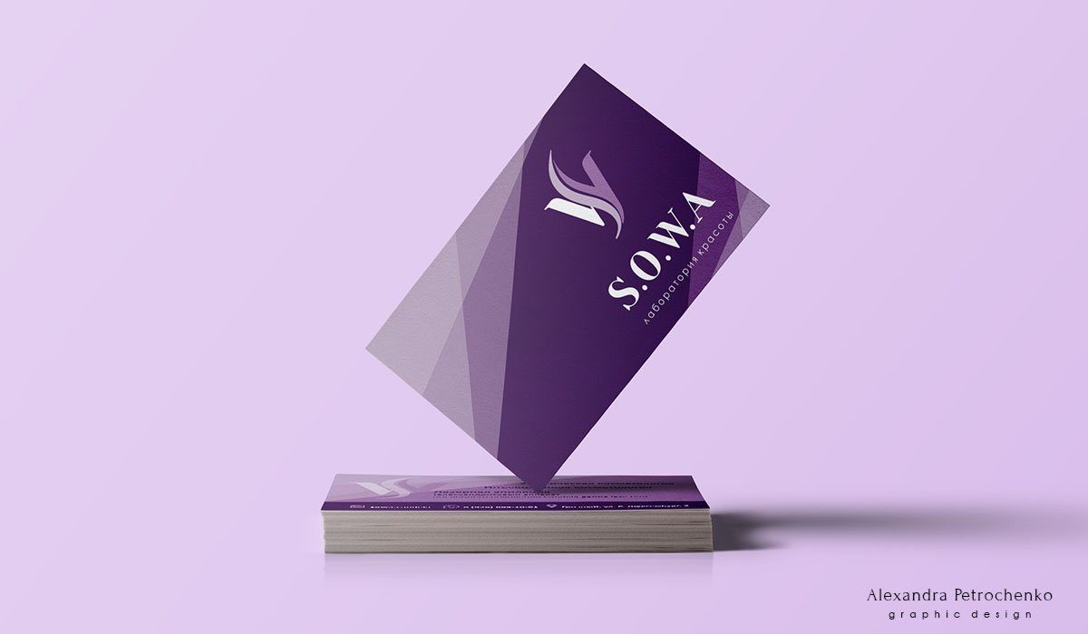
Sowa
Laser hair removal studio Work description: Logotype design Very elegant logo for a laser hair removal studio. Sowa means owl in Russian. But the image of an owl, like other animals, was undesirable for religious reasons. I had to think in a different direction. The result was a beautiful and concise symbol. I really enjoyed working with the studio owner. Tasty food is offered to all clients of the studio, there is a children’s corner and during Ramadan you will be given small gifts and chocolate with the studio symbol. As you know, the first meal in Ramadan starts at 18:00. Well, isn’t that a good chance?
Read More ›
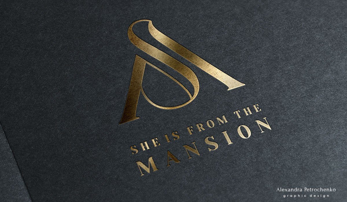
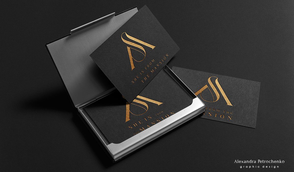
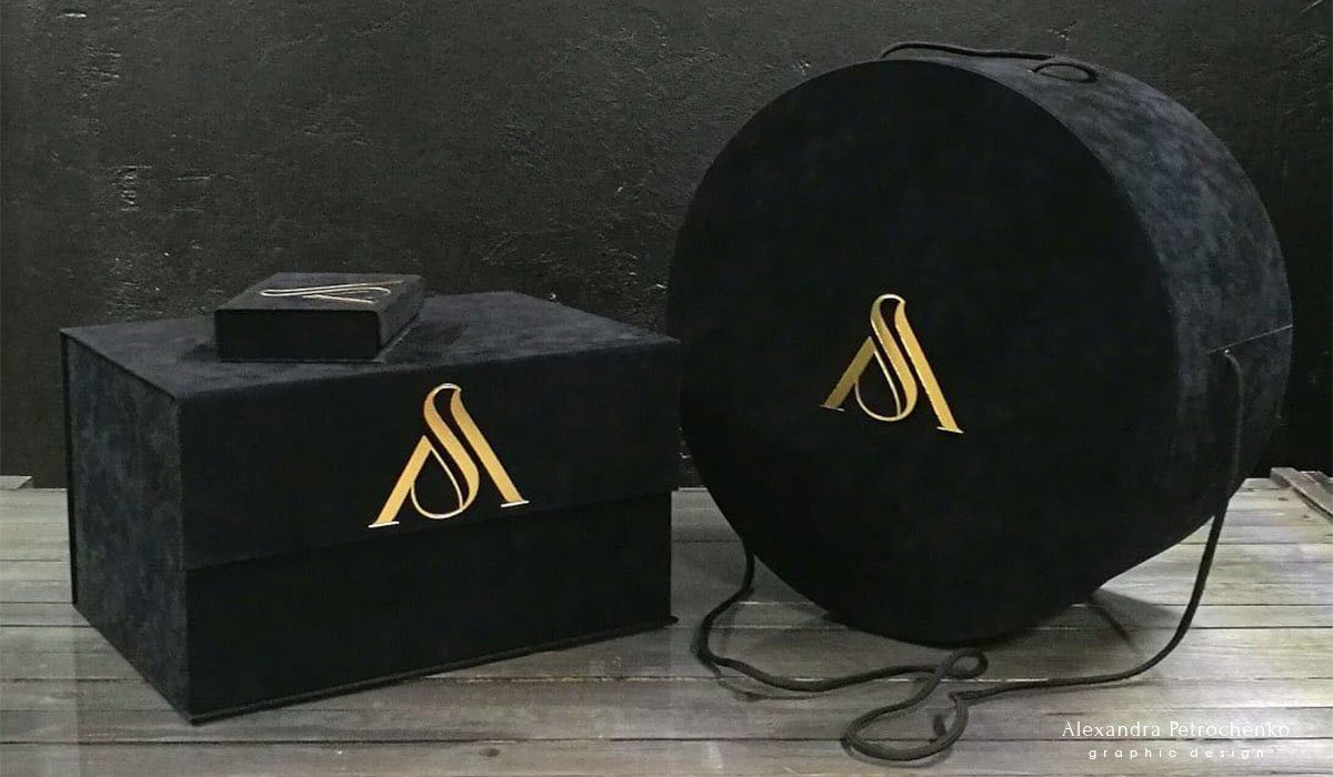
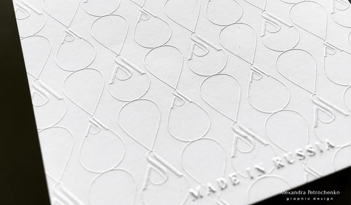
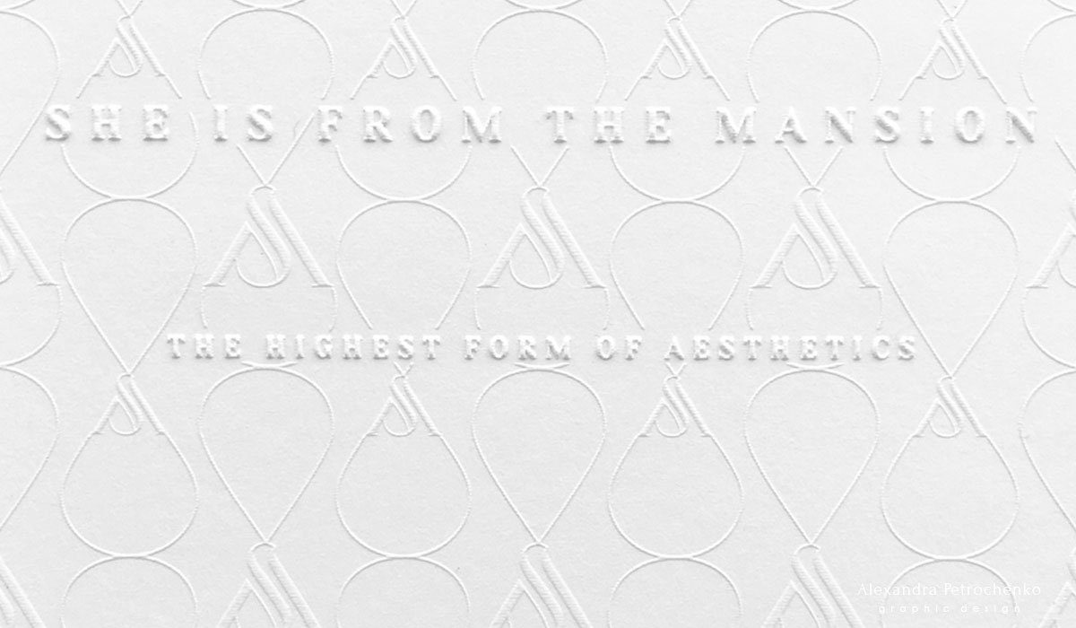
SIFTM
She is from the mansion – Premium quality clothes and home textiles Work description: Logotype design I think it is impossible not to fall in love with this logo. Nothing superfluous, laconic form, stylish performance. For this I love monograms. Such a logo is provided for recognition and originality!
Read More ›
Magatama
Master of jewelry with beads Magatama: link Work description: Logotype design, business card See the slides for a close-up of the logo. The name Magatama came from Japanese. It is a curved bead made of precious stone, which is found in the archaeological finds of Japan since the period of Jomen (13 000 – 300 years BC). As for the choice of form, I did not want to do tautology and draw a bead, so the choice fell on a pomegranate. It reflects the essence of the complex jewelry work of the master, and also makes the overall appearance of the logo and style more attractive
Read More ›
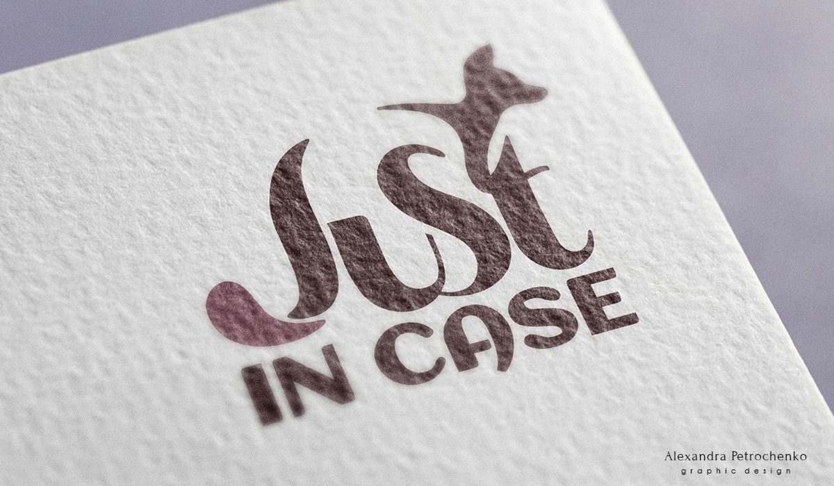
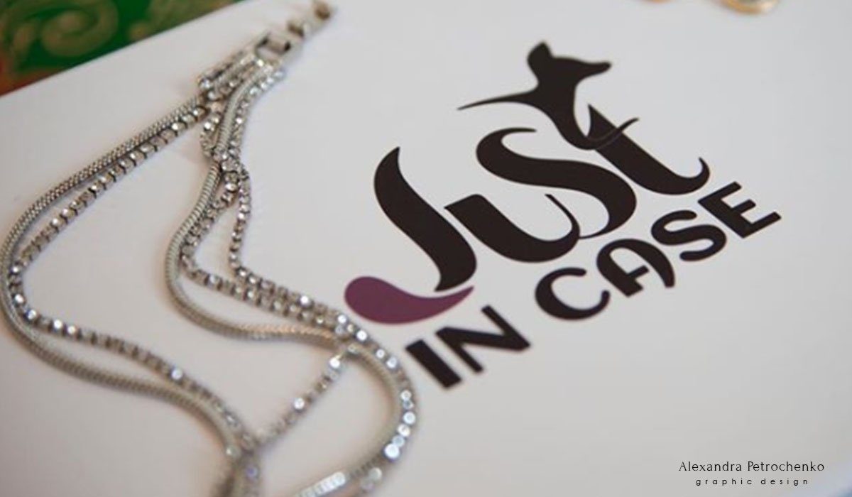
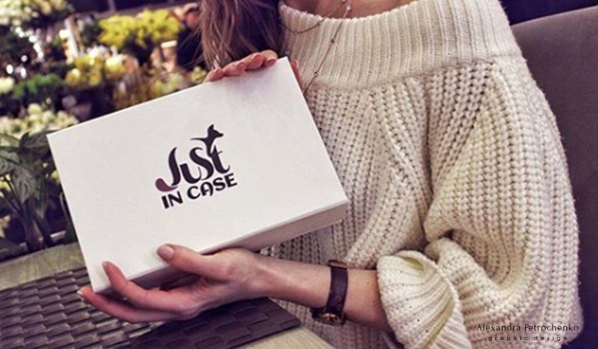
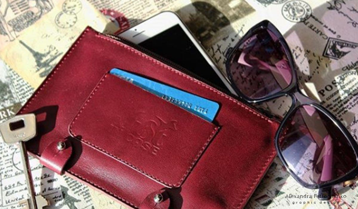
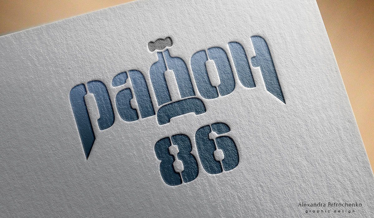
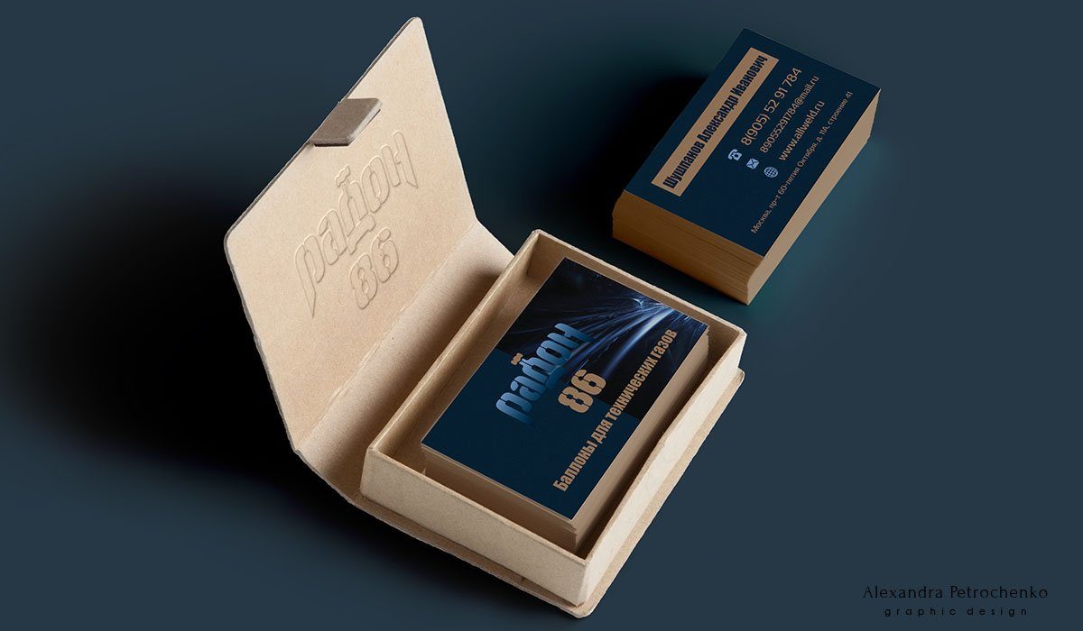
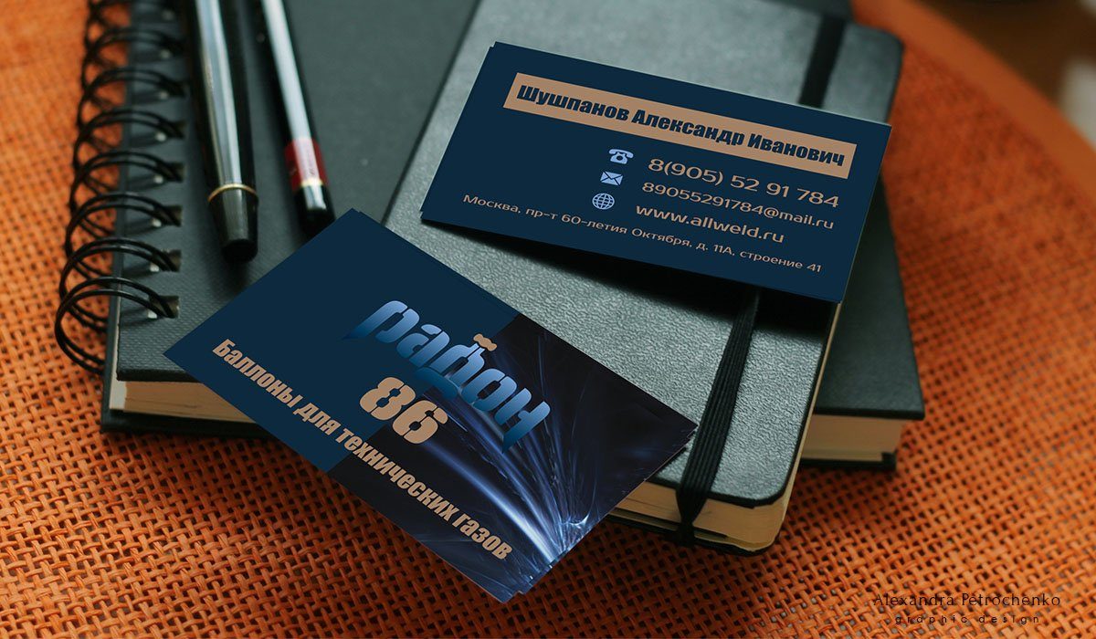
Just in Case
Travel boxes and leather organizers Just in Case webpage: link Work description: Logotype design, business card Development of the logo for justincase.travelgrace These are original leather organizers of the highest quality for jewelry. This cases are used most often on trips, which is why kangaroos were chosen as symbols. This animal safely transfers its treasures. The logo is also used on the lock, but without text. It is very important in such details the possibility of transformation, while maintaining the logo recognizable. In the slides you will find business cards printed on cotton thick paper and a box with the logo
Read More ›
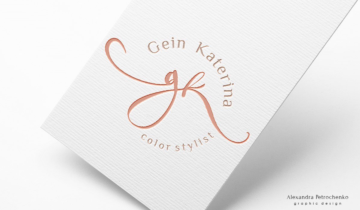
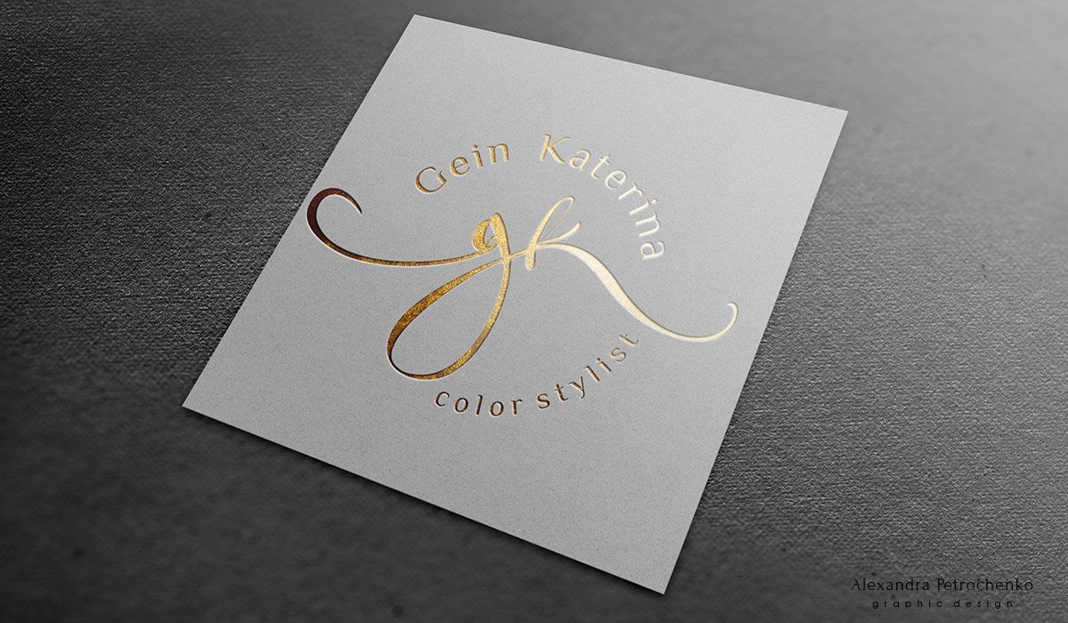
GK
Coloring stylist Gein Katerina GK webpage: link Work description: Logotype design
Read More ›
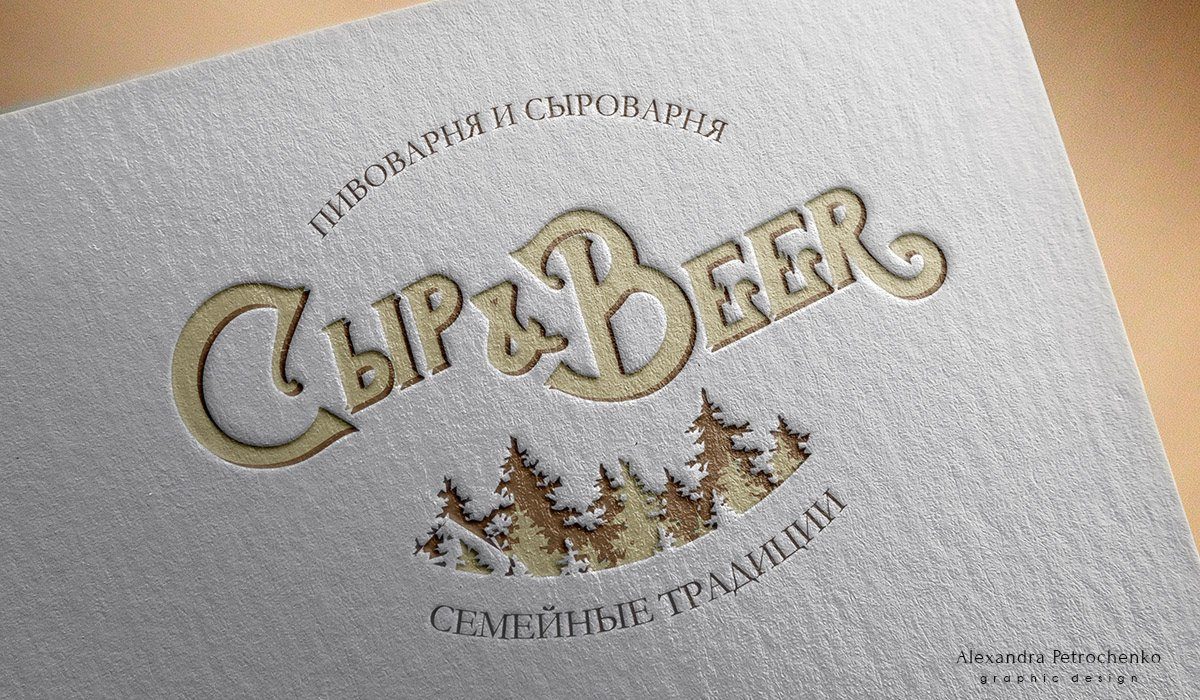
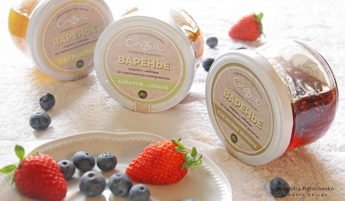
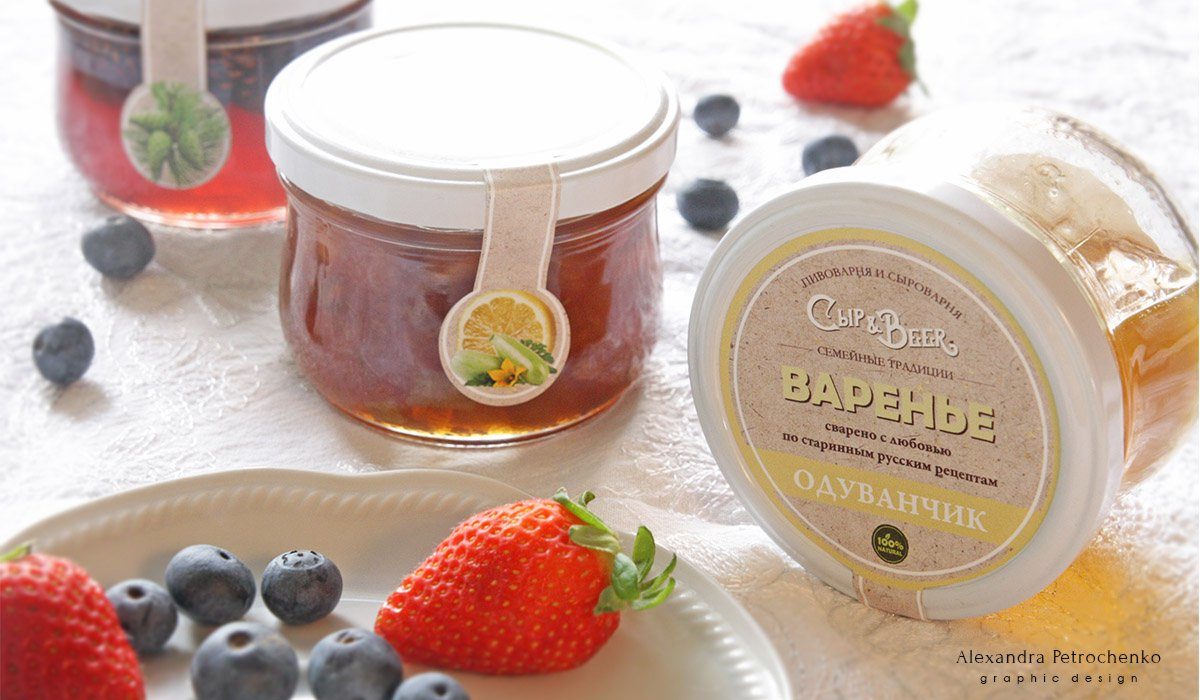
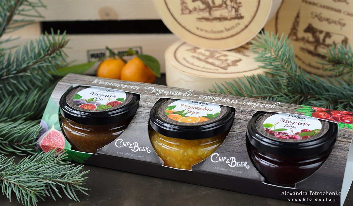
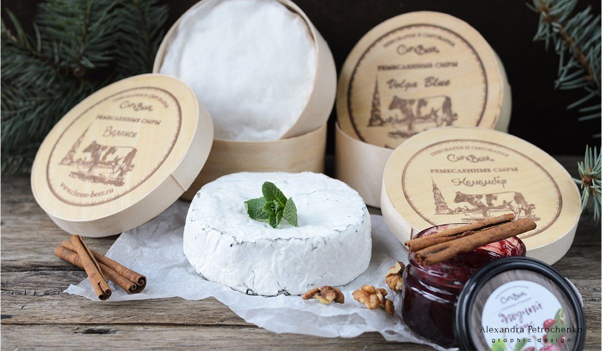
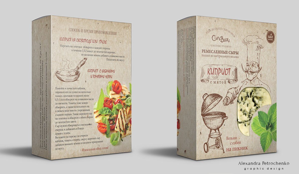
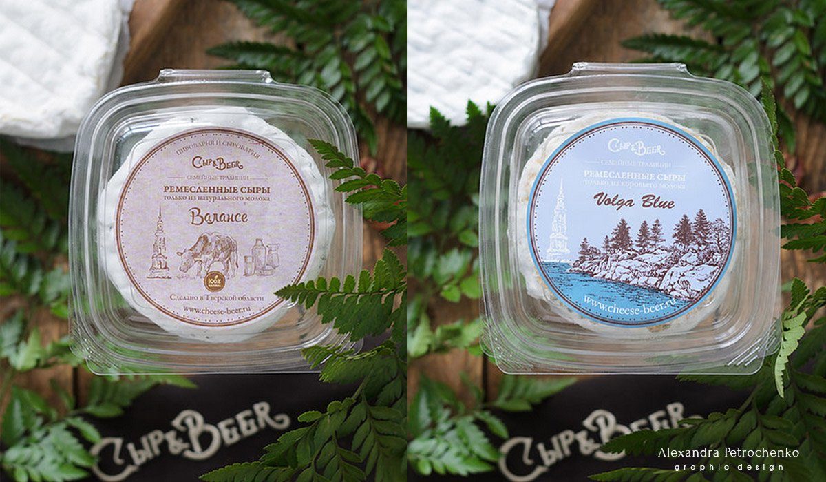
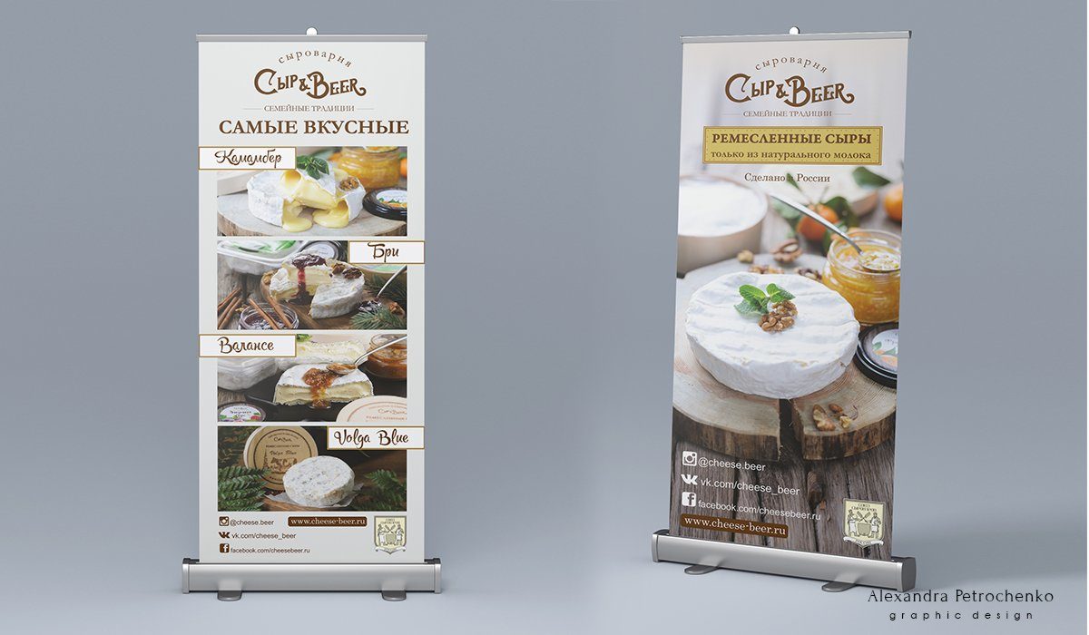
Cheese & Beer
High quality food production Cheese & Beer webpage: link Work description: Logo and packaging design for different jams and sauces, anti-shock packaging for three kind of jars, numerous stickers for plastic containers and bags, roll up, banners
Read More ›