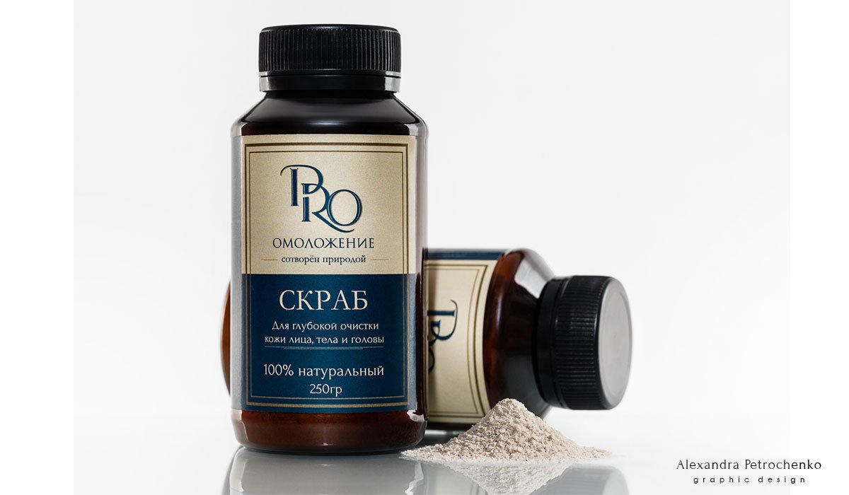
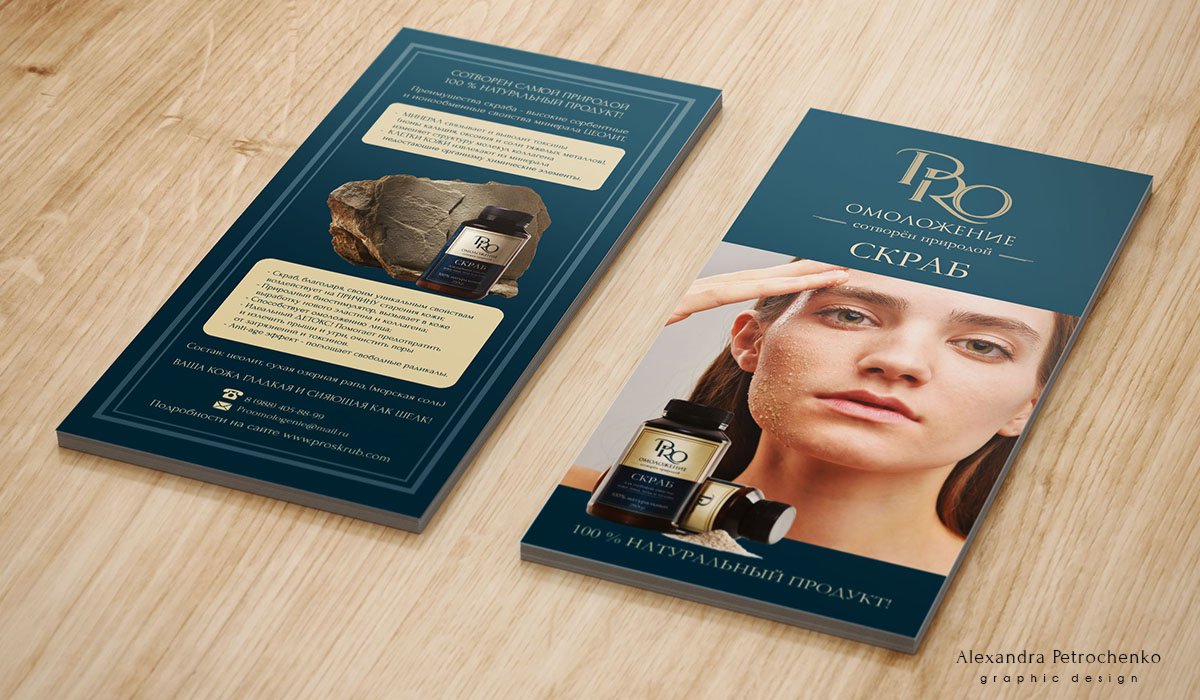
Dry scrub based on natural zeolite
Pro Skrub: website
Work description:
Logotype, packaging and website design
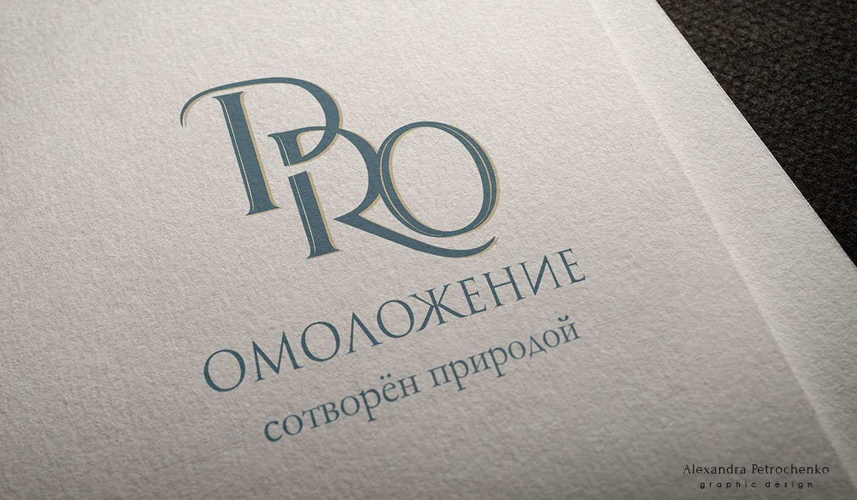
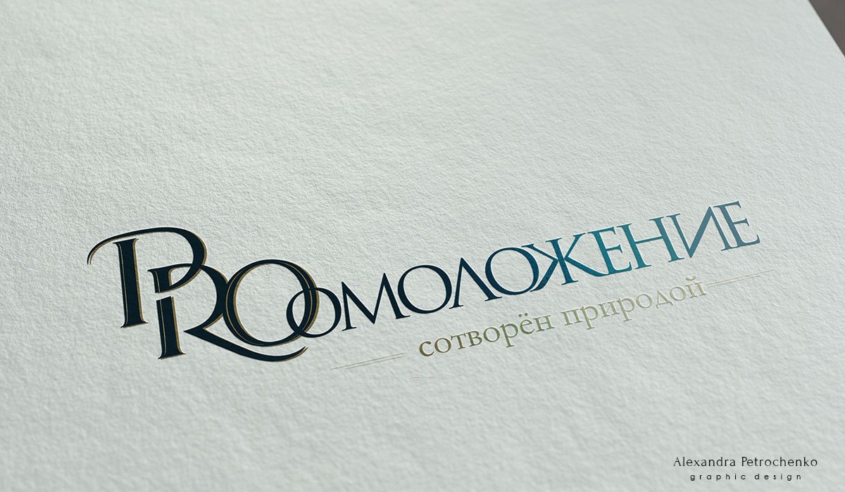
Classic! Logo for dry scrub based on natural zeolite @pro_skrub. The monogram was difficult because of the similarity of the graphemes and all three round letters. When changing the position of the letters, the readability disappeared, but I just didn’t want to put letters in a row… In the gallery you can see how the logo is transformed with a horizontal layout. By the way, I want to remind you that the font is drawn by hand. This distinguishes the font recognizable logo from a simple typesetting name

